Label Legend Design: Typography for Arm's Length and Bad Light
A label legend is typography under the worst conditions in the building: half-inch canvases, 203-dot rendering, readers in gloves holding flashlights. Office design instincts — elegant faces, tight tracking, subtle grays — all fail here. What works is a short list of blunt rules about dots, contrast, margins, and hierarchy, applied without exception.
1. Text Size Floors by Printhead Resolution
Two floors per resolution: what the head can render, and what a human can use. Design to the second one.
| Resolution | Print Floor | Human Floor | Context |
|---|---|---|---|
| 203 dpi | 6 pt print floor | 8–10 pt working minimum | Entry handhelds (M210 class) — design labels for it, not despite it |
| 300 dpi | 4–5 pt print floor | 6–8 pt working minimum | The industrial default (M610, i3300) — clean small text, fine barcodes per the barcode guide |
| 600 dpi | ~3 pt print floor | Set by eyesight, not the head | Production engines (i5100/i7100) — micro legends and 5 mil modules |
Distance rule of thumb for signs and rack labels: roughly 1 inch of letter height per 25 feet of viewing distance in good light — degrade generously for dim aisles and dirty lenses. The same logic drives ASME A13.1's letter-height-by-pipe-OD tables.
2. The Blunt Rules
- Sturdy sans-serif, regular-to-bold weight, default tracking. Condensed and light faces render gappy at thermal resolutions — the dots cannot split.
- Dark-on-light by default; reverse print only for header bars and status blocks. Never reverse a barcode.
- Keep 1–2 mm of clear margin inside the die-cut edge. Web tracking drifts slightly; content at the edge gets clipped on some fraction of every roll.
- One idea per line, biggest fact first: the wire number above the circuit description, the asset ID above the department. The two-second flashlight test is the acceptance criterion.
- ALL CAPS only for short identifiers (wire numbers, port IDs) — mixed case reads faster for anything sentence-like, which is why Z535 message panels are not shouted.
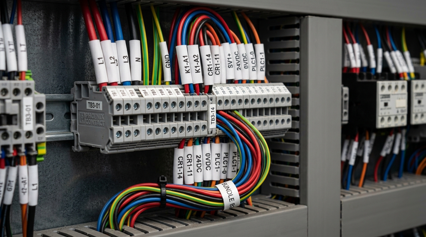
- On self-laminating wire wraps, keep the whole legend inside the printable zone height — anything below the line disappears under the clear wrap, per the AWG sizing chart geometry.
These rules survive contact with production only as locked label templates — font, sizes, and field positions fixed, operators filling in data. The day legend design becomes per-operator freehand is the day the facility's labels stop looking like one system.
Designing a nameplate specifically?
The nameplate design guide applies these typography rules to the 20-year identity plate: field checklists, hierarchy, and machine-readable serials.